|
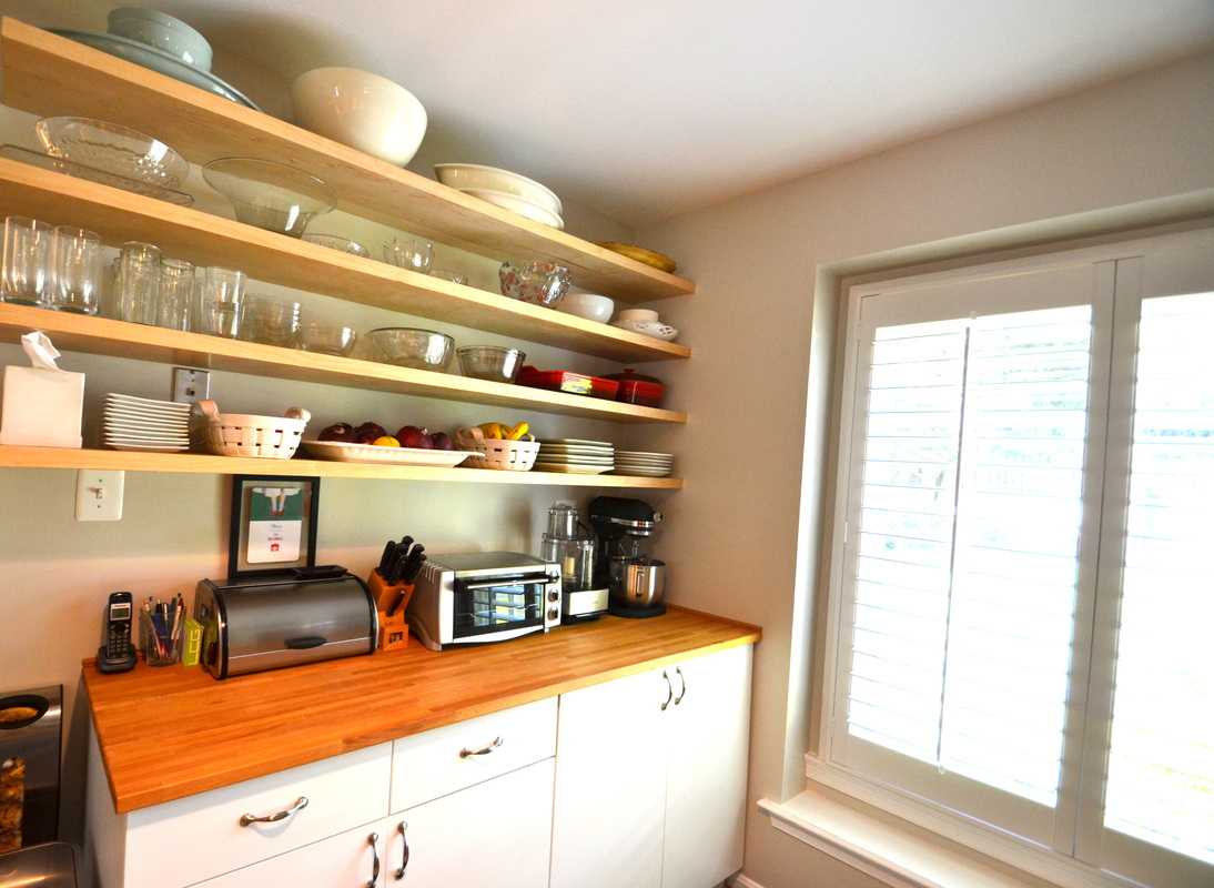
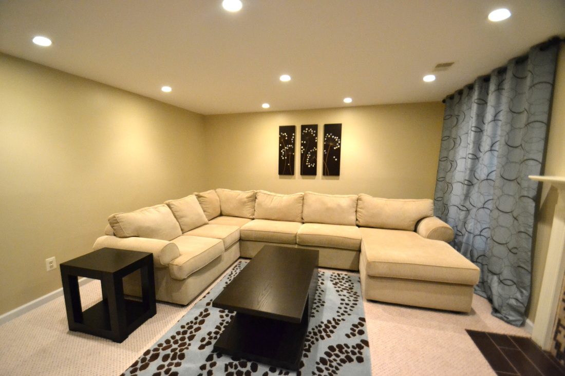
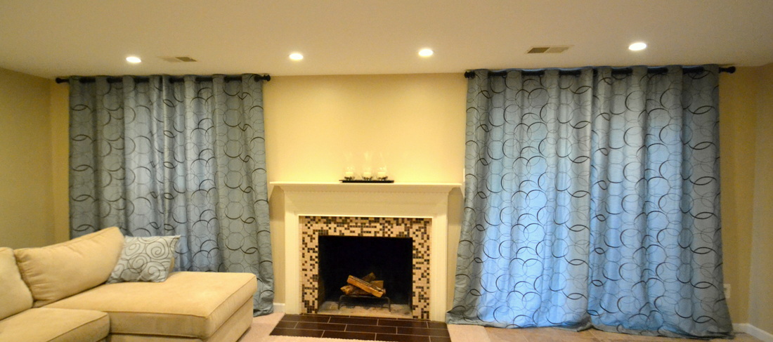
I'm sure you've had just about enough of my Mount Pleasant ramblings, but I have just ONE more. My mom has 8 dining chairs and 2 armchairs that she's been planning to recover for over 2 years. Although the seat fabric was pretty, it had seen better days, and the off-white was kind of drab against her current color scheme. She'd been waiting for a super DIY-er to show up!!! {but since none did, she let me do it.} ;-) Here's how NOT to recover chair seats in 5 simple steps! Step 1: Enthusiastically convince your mom that you can DEFINITELY recover the seats of her 10 dining chairs in about 5 minutes! Easy! No problem! 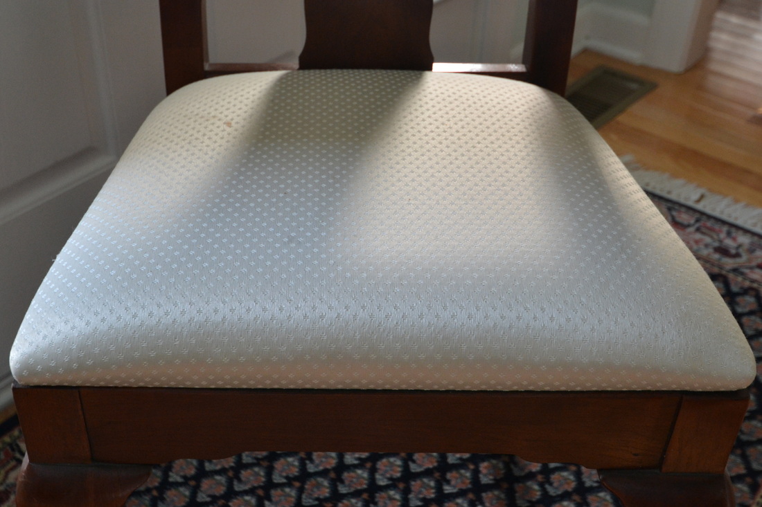 Step 2: Remove the seats of said chairs by simply unscrewing them! Simple, right? Yay! 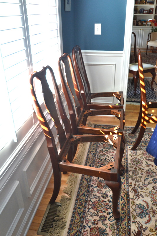 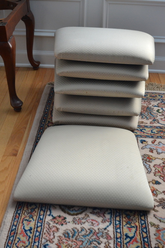 Step 3 {feel free to skip this one}: Borrow a staple gun from a neighbor. Start stapling. Staples look crooked and messy, so remove them. Repeatedly jam the staple gun. Injure fingers trying to dislodge staples. Decide that a kabob skewer is the ONLY tool for the job. Successfully clear the jam, but bend skewer. Apologize to mom and throw bent skewer in the trash. Promise your mom you'll actually start work pretty soon. Turn a previously neat and tidy dining room into a big mess! Leave mess for 3 days. 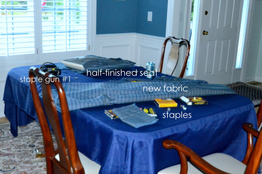 Step 4: Send your dad and husband to the store for a more low-tech staple gun. Measure the seats, cut the fabric {ensuring that there is at least 2 inches of overlap on all sides}. Tell your mom you will probably run out of fabric, so she should probably start planning for some mismatched chairs {didn't happen}. Mom graciously agrees, even as she thinks to herself that she definitely ordered plenty of fabric? Proclaim this new staple gun the BEST ONE EVER! {Did I mention it was $12?} Dance around stapling happily.  Chug Diet Cokes and talk trash about this staple gun {even though it probably didn't work because of user error}:  Step 5: Mentally plan a trip to a {probably really faraway} fabric store to get some more fabric, because you KNOW there won't be enough {again...there was}. Take WAY too long to cover seats, while ignoring your mom's politely concerned glances. Struggle with the corners, struggle to not cover the pre-drilled screw holes with fabric, and finally, struggle to re-screw the seats onto the chair bases. Drop seats on the floor, on toes, etc. But FINALLY: deliver 10 chairs with recovered seats {and lots of extra, unused fabric} to your patient, flexible, and super-appreciative mom: 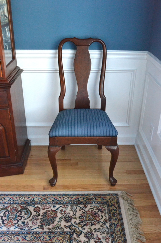 *Side note: Isn't the paint color beautiful? You should see the ceiling; it's a tray ceiling with varying shades of blue. I wish I would have taken a picture, but you know...
I was kind of busy. ;-) Happy Thursday, everyone! {Shared at AKA Designs, The Shabby Creek Cottage, and Addicted @ Decorating}
4 Comments
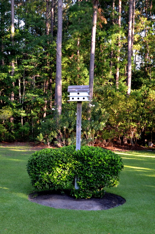
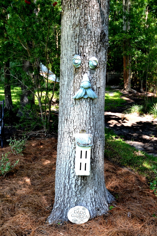
Hey there! As promised, I'm back with some more photos from my parents' gorgeous yard in Mount Pleasant, South Carolina. I also NEED to show you some of the other homes in their neighborhood. You'll be glad to know that it wasn't creepy or weird AT ALL to do drive-by photos in a lovely gated community in broad daylight! As we were driving around, I said to Brian, "we should have done this during the week. On Saturdays there are too many witnesses." Weird stalker tendencies aside, here goes! My parents' backyard is really cool because there are so many special little areas for relaxation, such as: 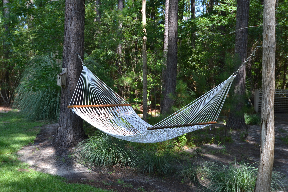 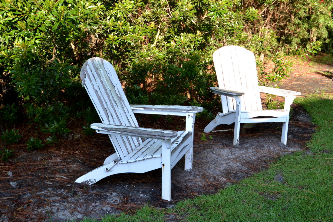 They also have so many cool/quirky little features and fun yard decor:
And...BAM! Palm trees too.  On to the rest of the 'hood. {Excuse the photography, but it's hard to get good shots out the window of a moving car.} Is this gorgeous or what?!?! 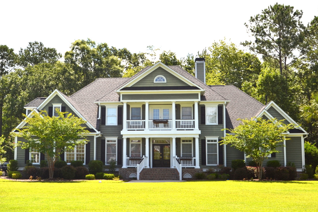 OK, this photo doesn't do this house justice at all! The detached garage is awesome.  And the grand finale...this house is near the golf club, and set WAY back to keep the riffraff {yours truly} away. The photo is blurry because I took it from a safe distance:  And finally: I snapped some shots of these beautiful beach homes. Aren't they just perfect? 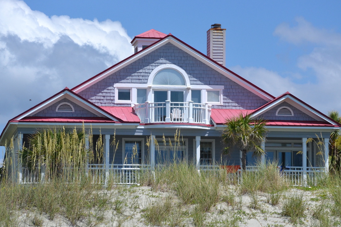 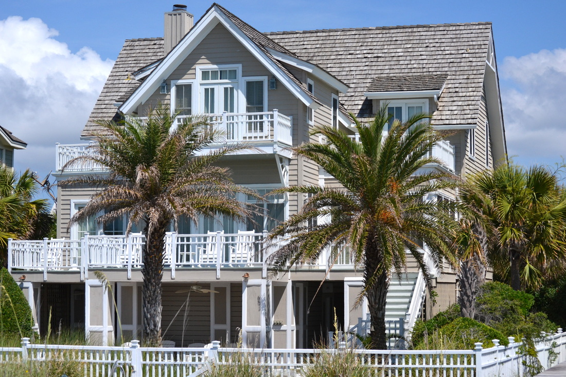 That's it for now!
I'll be back with the third and final installment in this little series... it involves chairs, 2 staple guns, and fabric. I was feeling like an old pro since I've done this exactly once before, but let's just say it took a liiiiiiittle longer than I thought. As things always do. Happy Tuesday, everyone! This week, we're in beautiful Mount Pleasant, South Carolina visiting my parents. Mount Pleasant is about 15 miles from Charleston, and they live in a gated community in an area called Dunes West. Here's their house. Isn't it so pretty? 
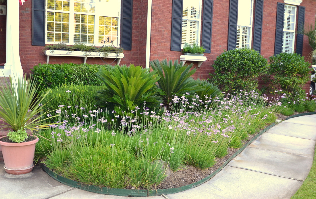
My Dad is a ROCK STAR with landscaping. Their house sits on about an acre of land, and it's seriously stunning. Every time he comes to Virginia, he kindly hits up the Home Depot and plants a few things, so our yard isn't a complete disgrace. {Whether we keep said plants alive is another story, of course.} His plants, on the other hand... 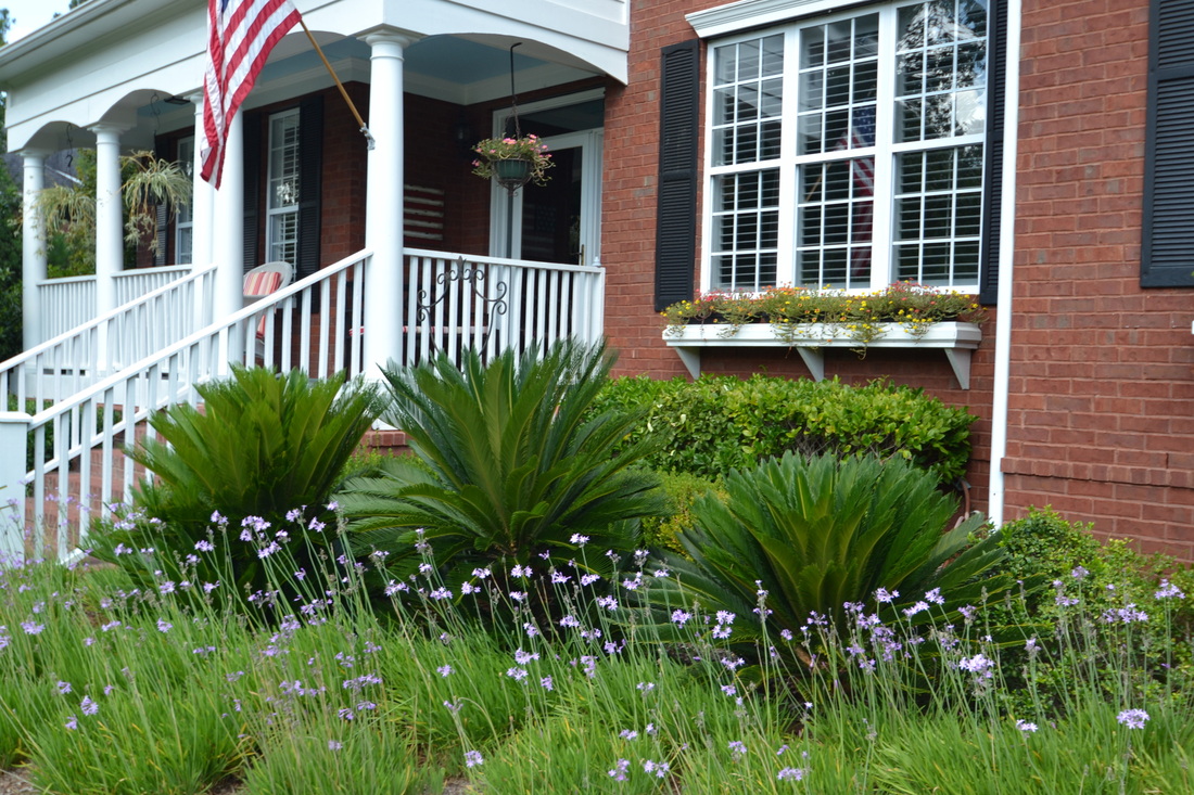
Could you die over these window boxes?! This almost makes me want to plant some stuff myself. ALMOST. ;-) 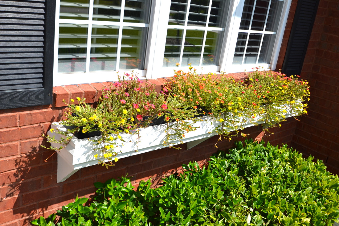
They painted their front porch ceiling "haint blue," and they say it really does keep the bugs away {not sure about ghosts, though.} 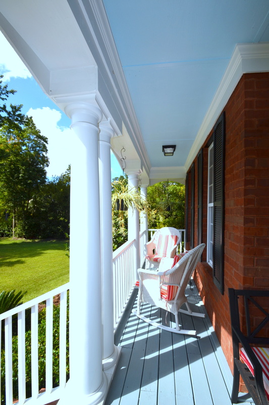
They painted their front porch and their back screened-in porch floors in a semi-gloss gray: 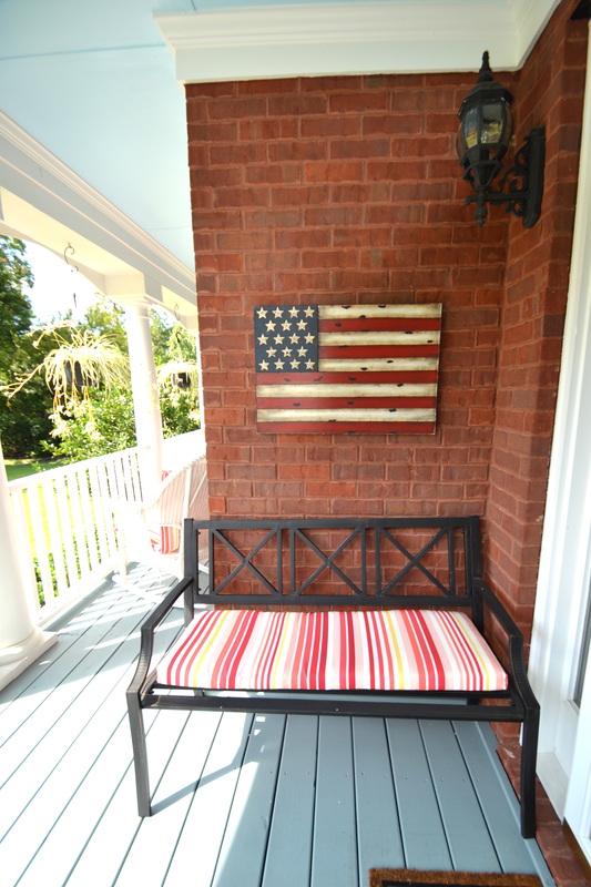

While we were there, we did a little of this... 
...and a little of that... 
And even some of this! Come on! You knew I'd sneak in a little DIY action, didn't you? 
I'll be back with more photos of my parents' beautiful house,
and details on reupholstering my Mom's dining chairs. In the meantime, thanks to Mom and Dad for a great time! We love you! xoxo The screened-in porch is what sold us on this house. You may have read my other posts, in which I complain relentlessly about the bad decor, which has taken us over 3 and 1/2 years to START to undo. The exterior is the house isn't horrible, but it's definitely nothing special. But this porch is pretty cool...at least we think so! Past posts have detailed my adventures in spray paint when I refinished our Adirondack chairs, the times when we used the porch as a staging area/junk yard during our kitchen renovation, a little feature about the waterfall, and my favorite lounging spot, "The Mommy Chair." However, I've had a lot of challenges with photographing this space. Either it looks immense and empty, or too close-up. I'm sure a skilled photographer would be able to figure it out, but since I'm not one of those, I'll continue to toil away until I get it right. You'll be the first to know when I do! In the meantime, here's a sneak peek. You will notice a theme: Blue, blue, and more blue. Who isn't completely obsessed with...I mean, who doesn't love a little blue? ;-) Case in point: if one blue pillow is good, five blue pillows are better...am I right?! 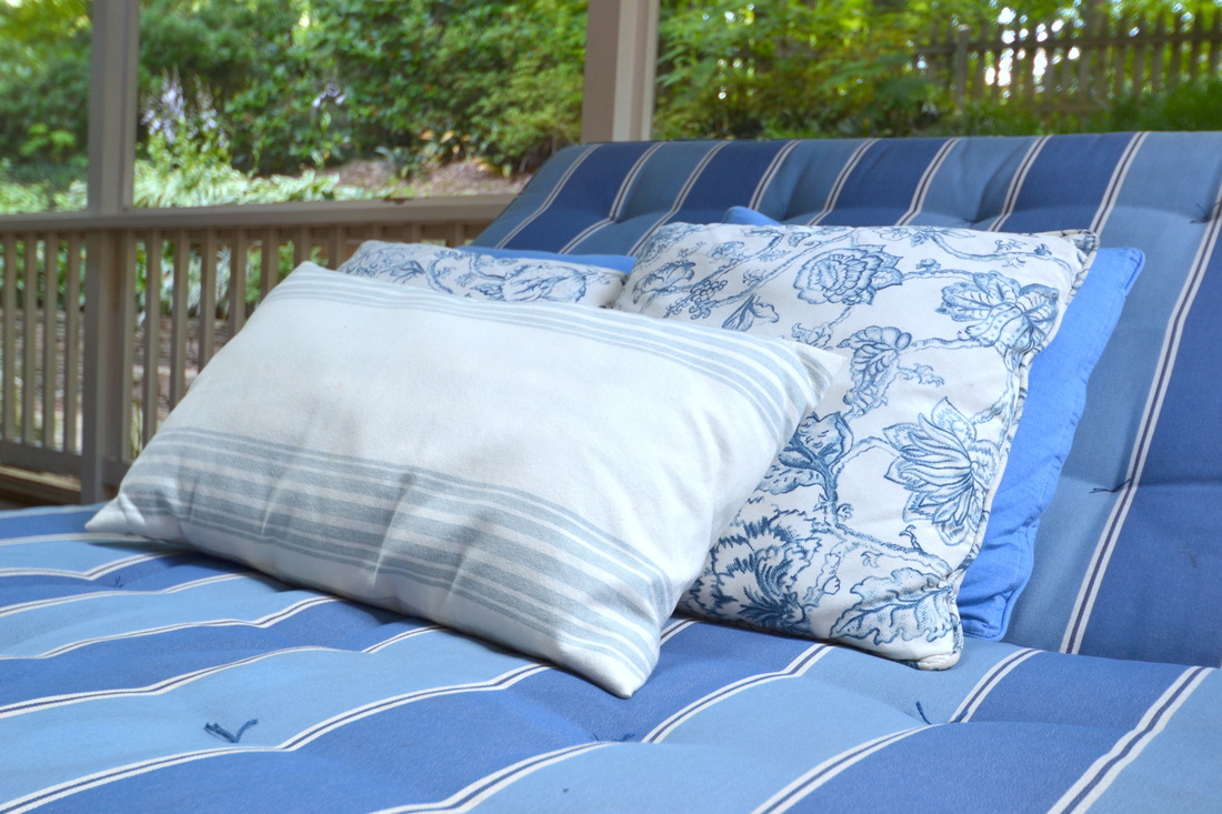 Here's the dining table{s}...they are actually two tables pushed together and covered with a cloth. You can also see that many of the misfit chairs throughout our house have made their way here: 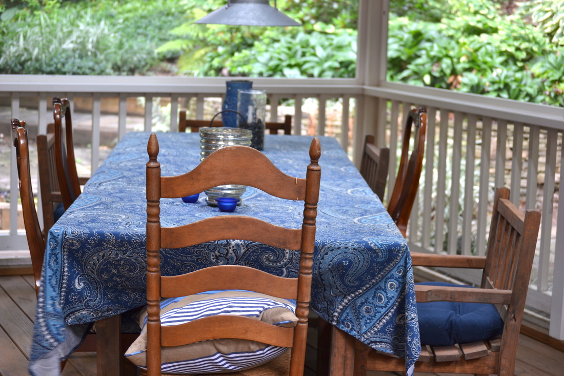 The previous owners used galvanized metal light fixtures out here. Finally, something worth keeping! 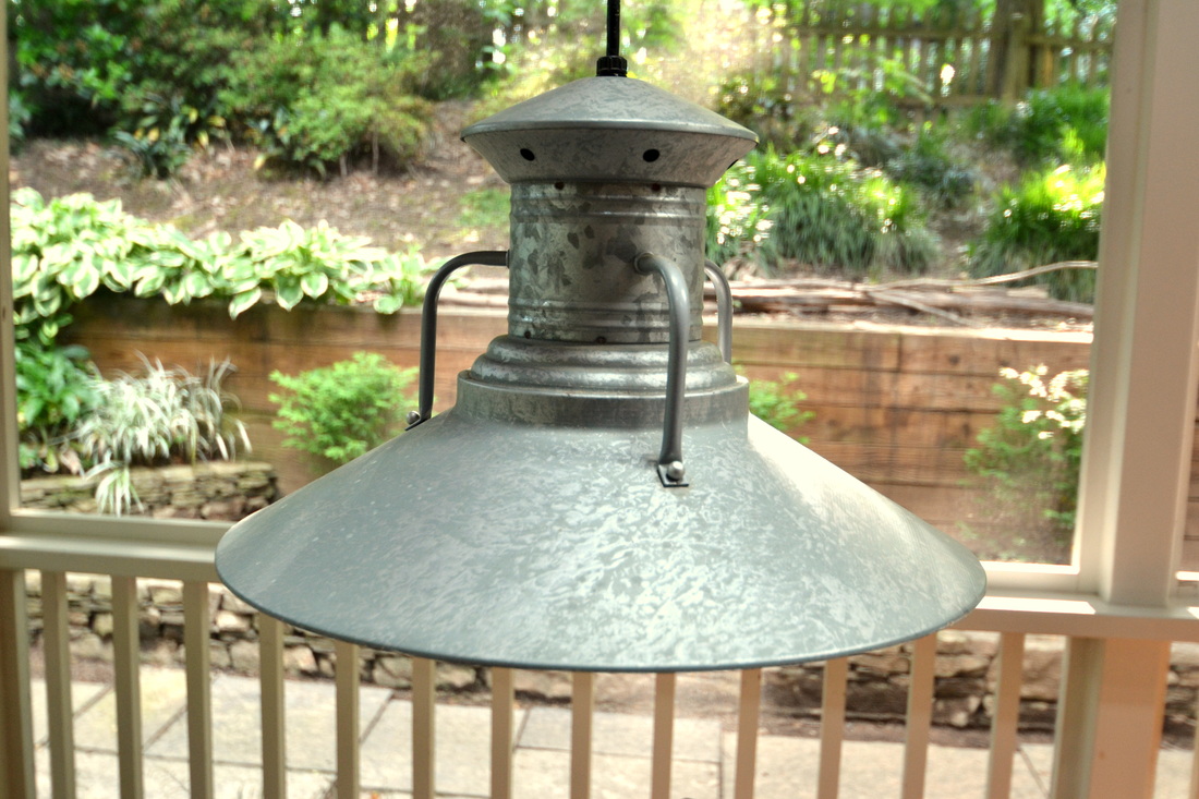 Gratuitous candle shot...these guys are my second obsession, right behind blue {just imagine my excitement when I find a BLUE CANDLE HOLDER!} 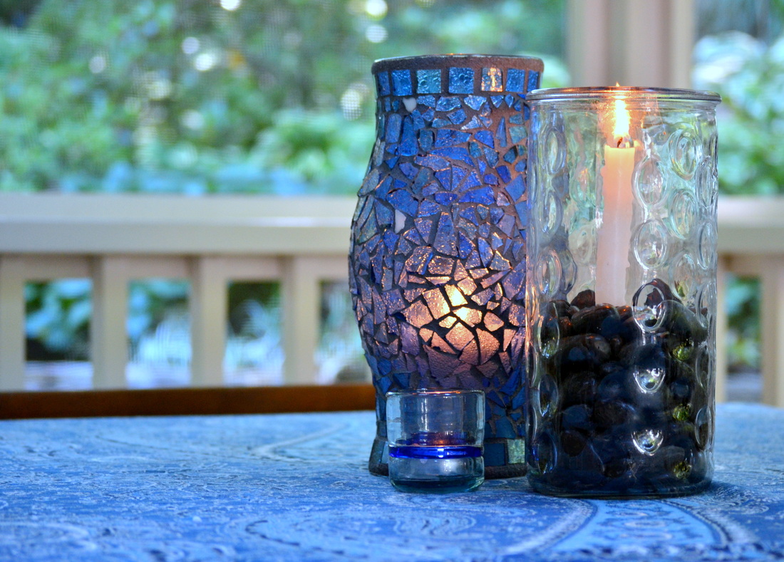 Thanks for checking out my little sneak peek. I'll be back with a full photo shoot soon, I promise! In the meantime, check out the awesome summer spaces over at Thrifty Decor Chick and The Lettered Cottage. :-)   Hey there! I'm sure you're a little tired of looking at our small fixer-upper, so let me show you something a bit more Pinteresting... ;-) Welcome to my pretend stone dream house, generated entirely by Pinterest. That's not weird, is it? Don't judge me. Just roll with it. ********* Here's the exterior:  Source: thingsthatinspire.net via sixteen fourteen on Pinterest Welcome to family room #1! I love the arched stone fireplace {and the way the wood is stacked in it, I assume for summer?} The green bottles and neutral upholstery are great, too.  Source: laurenleonardinteriors.com via sixteen fourteen on Pinterest Here's family room #2. I love the ceiling, huge coffee tables, and extra-deep leather sofa:  Source: houzz.com via sixteen fourteen on Pinterest Here's the living room, for those times when you're feeling a little more dramatic... But I think the decor actually makes this 2-story space seem cozy:  Source: countryliving.com via sixteen fourteen on Pinterest Would you believe this is the best I could do for the kitchen? It's gorgeous, but not very "stony." Let me know if you see a better one:  Source: sixteenfourteen.weebly.com via sixteen fourteen on Pinterest I think this is in the basement...let's just SAY it is, and that those beautiful french doors lead to the wine cellar. Look at this gorgeous stone, trimwork, and lighting!  Source: seafoam-dreams.tumblr.com via Andrea on Pinterest Here is dining room #1, on the formal side...  Source: sixteenfourteen.weebly.com via sixteen fourteen on Pinterest ...and #2, which is more casual.  Source: alifesdesign.blogspot.com via sixteen fourteen on Pinterest Here is the bathroom {again, stone bathrooms were hard to come by!}  Source: dagmarbleasdale.com via Jackie on Pinterest This is one of my favorites, because of the stone but also, the arched doorway and the gallery in the hall:  Source: robinstubbert.com via sixteen fourteen on Pinterest Here are a few shots of the guest suite. Aren't those bunk beds unbelievable?! It's probably a little hard to climb into the middle one, though. How does one do that, exactly? You'd almost need two ladders, right? {Sorry, I'm terrible at suspending disbelief!}  Source: athomearkansas.com via sixteen fourteen on Pinterest The stable {below} is one of my absolute favorites. It makes me want to hang white lights in every single room in my house:  Source: cotedetexas.blogspot.com via sixteen fourteen on Pinterest Thanks for joining me on this "tour!"
Have you seen any awesome stone spaces? If so, please share! Have a great Monday! :-) Am I the only one who LOVES a hideous "Before" shot? When Attia sent me these photos, I swear I was giddy! Believe me when I say she is WAY too fabulous to tolerate this.... she's one of the most glamorous girls I know! As they say in preschool: "This was NOT OK, friend." ;-) 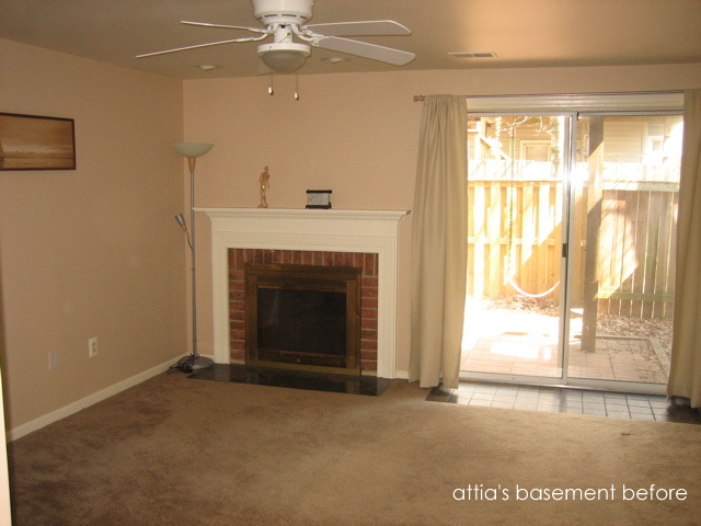
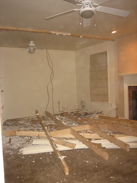
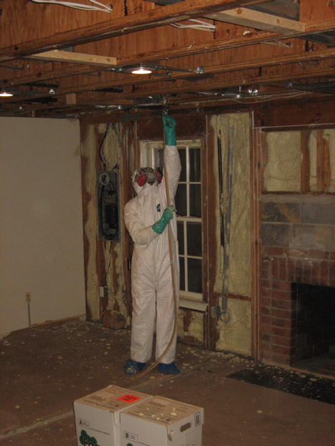
First comes a MASSIVE demo {this would make my HUSBAND giddy!} {By the way, the pictures below definitely resemble our basement right now... I'm trying not to think about it.} Just look at the window they installed to the left! And a fireplace in the basement! 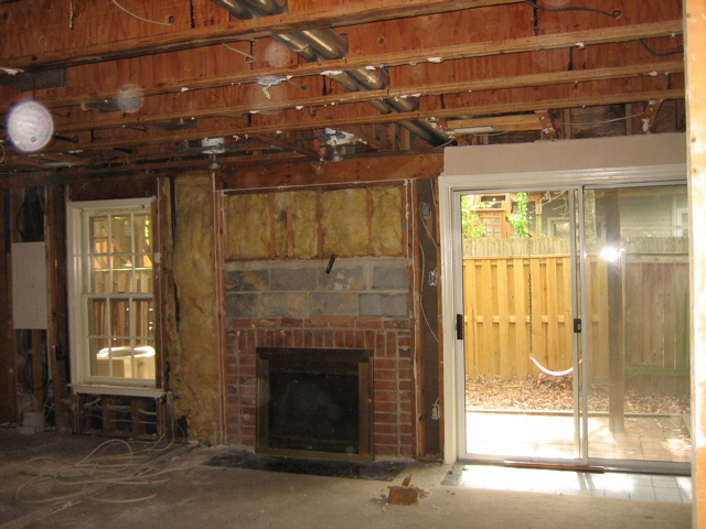
And now...the "Afters!" Attia did SUCH a beautiful job of selecting the paint color, adding downlights, and finding contemporary-yet-comfortable furniture for the space. She still has some decorating to finish {lamps, throws, mirrors, maybe a console?} but LOOK at this dramatic difference! 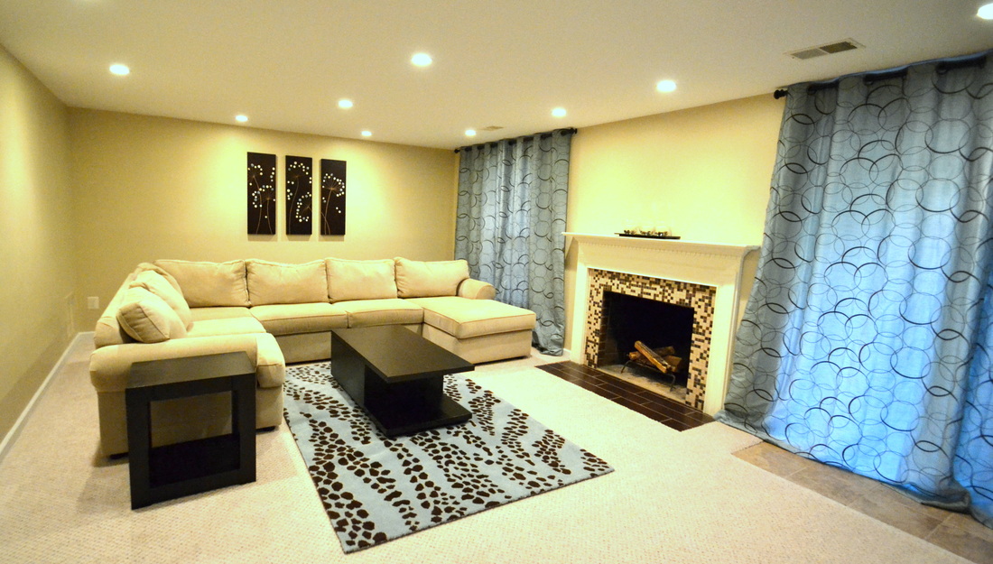
I was really excited to write this post, because Attia and I have very different decorating styles. While mine is more traditional {transitional at best!}, Attia's is much more contemporary. Isn't it fun to mix it up once in a while? :-)
I love the clean lines of her furniture. Attia, thank you so much for sharing your beautiful renovation with me! You did an amazing job, and I can't wait to come back and post about your kitchen. Besides that, you're a wonderful person with style to spare. Happy Thursday! A few months ago, I visited my neighbor Eryn to check out her master bathroom renovation. Trust me when I say IT IS FABULOUS, and I'll be posting about it the minute she tells me it's officially finished. That will happen soon, right Eryn? ;-) Here's a preview: Walls were removed, beautiful tile work was installed, and the vanity, lighting, and custom details are absolutely stunning. But while I was there admiring the bathroom awesomeness, I couldn't help but notice her kitchen. Here's why: I thought, wouldn't we all love to rip down walls and create custom spaces, to live up to the vision of perfection we hold in our minds? Sure. But sometimes, a few strategic changes can dramatically upgrade a space while we're making decisions about our broader renovation priorities. The homes in our neighborhood were built in the early 1980s, which means the possible projects are literally endless. ENDLESS. And a girl's gotta start somewhere! The Lowdown Cabinets: Builder standard oak finish Floors: Linoleum, with a dated floral pattern Windows: Large window into the kitchen provided lots of natural light, but the lack of window treatments produced the "I'm living in a fishbowl" effect. An opening between the kitchen and living room was drywalled over, which closed in the space and blocked a beautiful view of the backyard. Below is a "before" shot of the cabinets. You can see that the nice butcher-block top disappears because of the monochromatic wood tones: 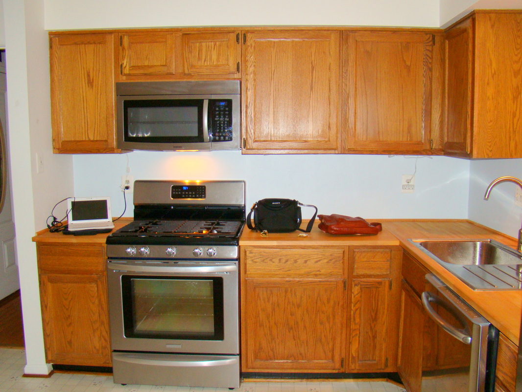 See the white space above the sink {below}? It's about to be gone! Yeah! ;-) 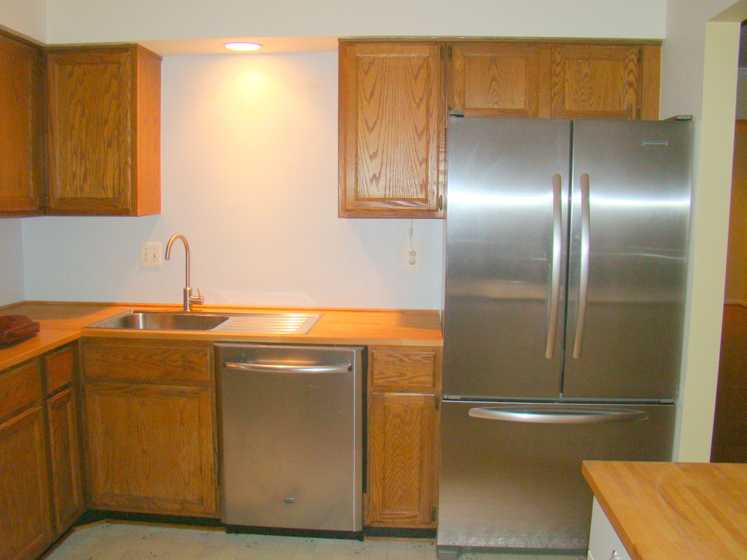 Here you can see the floors and the huge window {beautiful, but lacking privacy}. The wall on the left was basically wasted storage space, which cannot be tolerated in these tiny kitchens!  Post-demo, the opening between the kitchen and living room now looks straight through to the gorgeous tree-filled backyard, and provides even more natural light: 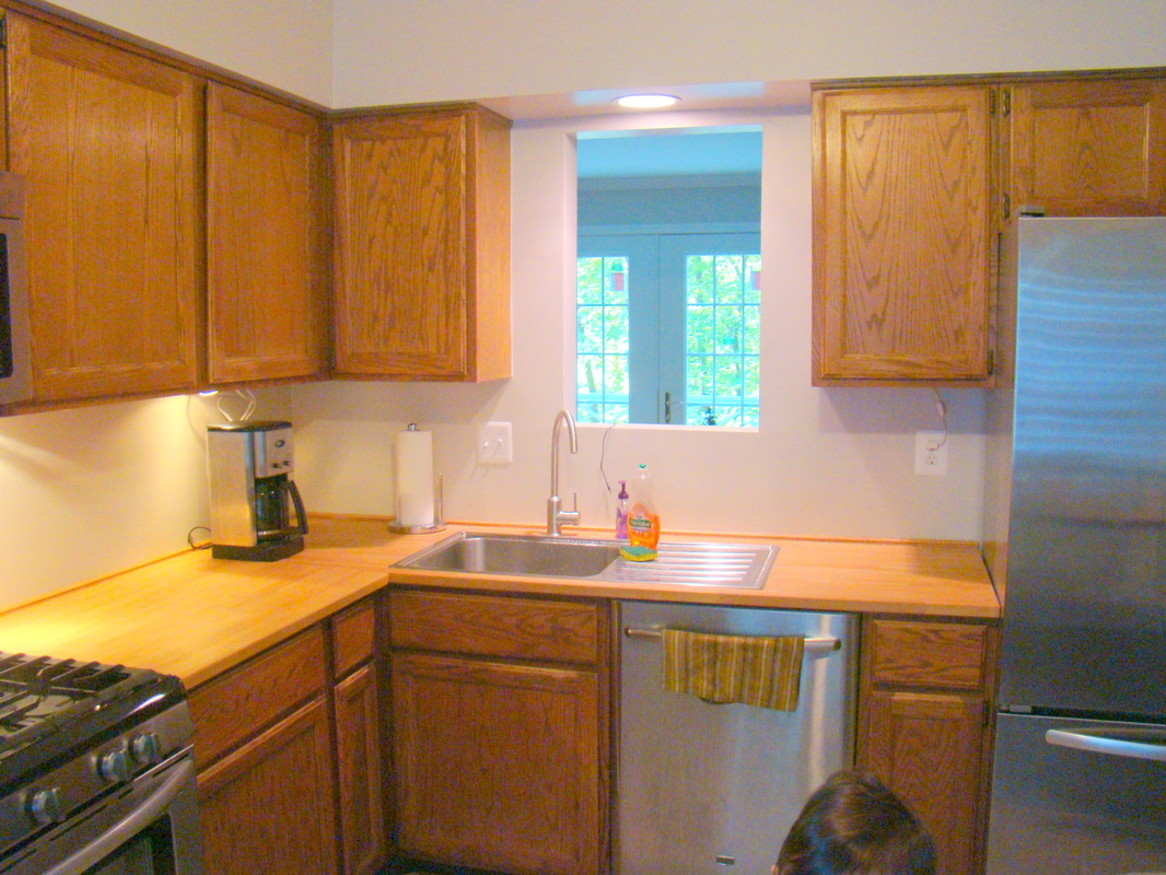 And now, the best part...after shots! Below is the area above the cabinets, which was previously a blank wall. Now, there are floating shelves which provide lots of storage and look great! Eryn also installed beautiful white plantation shutters over the large window:  Here's a close up of the floating shelves:  Look at this transformation. Isn't paint amazing?! The white cabinets make the kitchen look fresh and modern, and I love the contrast between the cabinets, counters, and appliances. 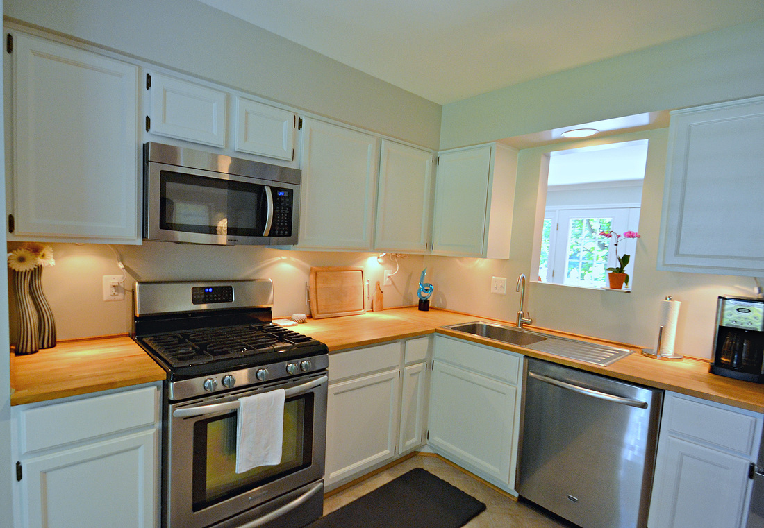 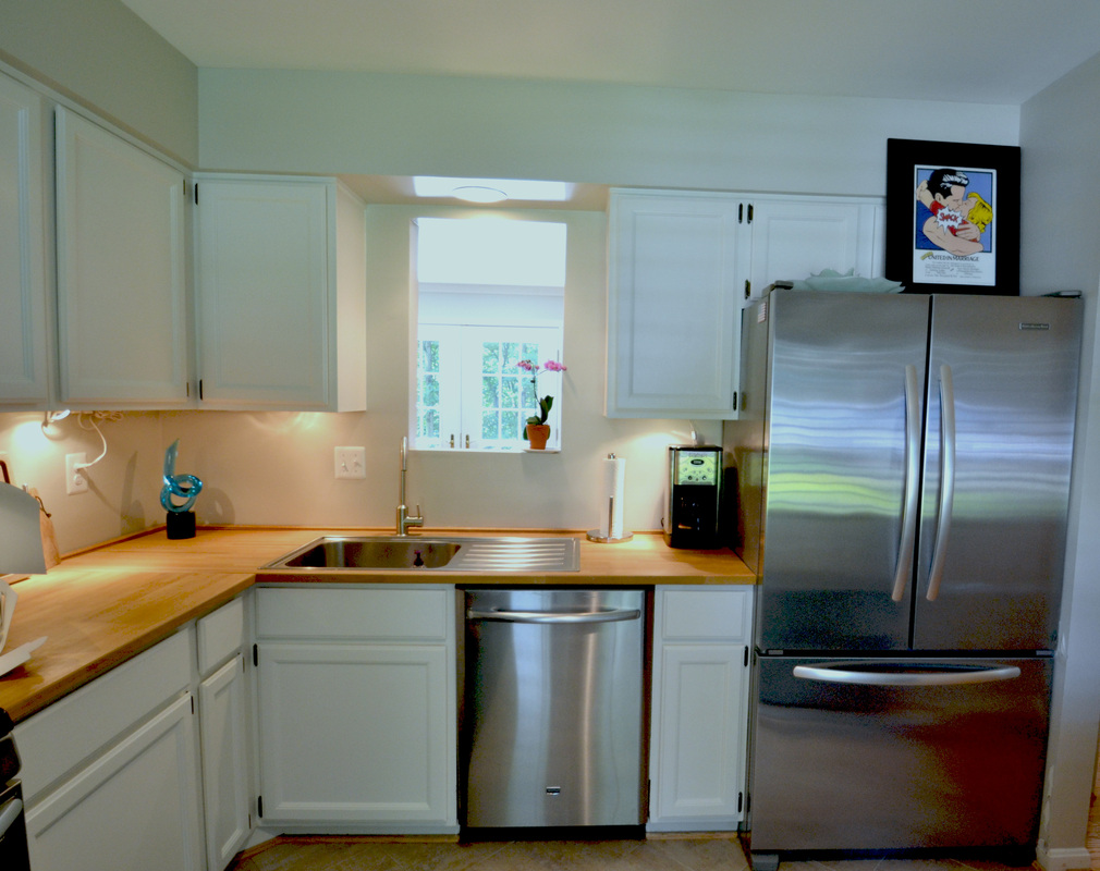 Here's a close-up of the new floors. A vast improvement over floral linoleum! 
Project Summary
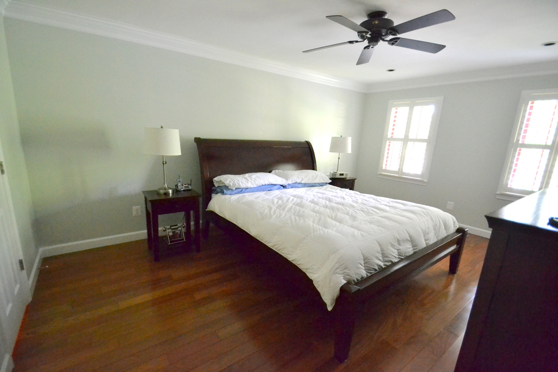
Cabinets: Original cabinets, painted white {hardware will be added} Floors: New tile {peel & stick!} from Home Depot Window: Plantation shutters from Next Day Blinds Walls: Floating shelves from Wayne Hopper Carpentry Eryn, thank you for being a Reston Remodelista! I'm looking forward to showing off your master bath soon! :-) I posted here about my blank-slate master bedroom. As a reminder, here's a "Before & During" comparison:
Below I've added some more photos, so you can see the details. The three dressers below seemed like a good idea, but they really impede the flow by limiting the walkway at the foot of the bed. The one in the middle can't be moved, but I'm looking for alternate locations for the other two. {Would you believe that Brian has the 2 on the right completely filled, in addition to his 1.5 closets? The man is a clothes hoarder!} 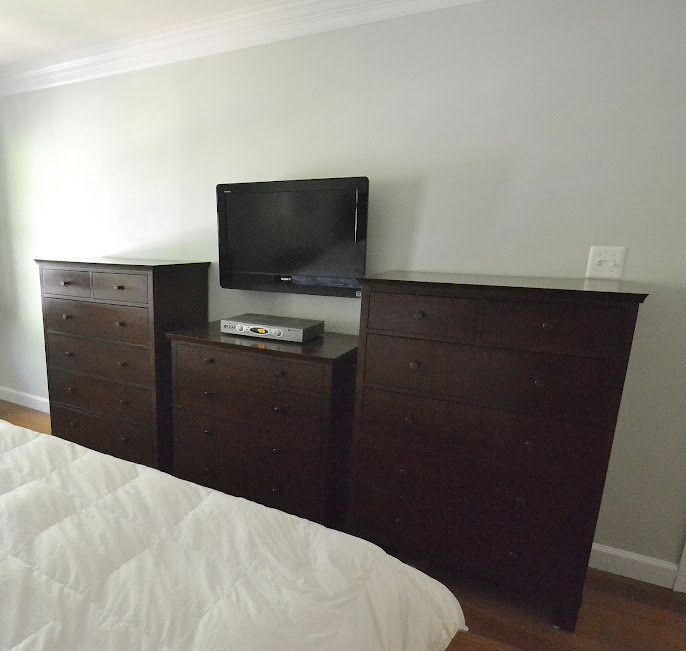
Below you can see the crown molding and the plantation shutters. I'm currently deciding whether I should put drapes over these: 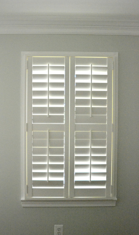
...and here's a close-up of the base molding, paint, and floors: 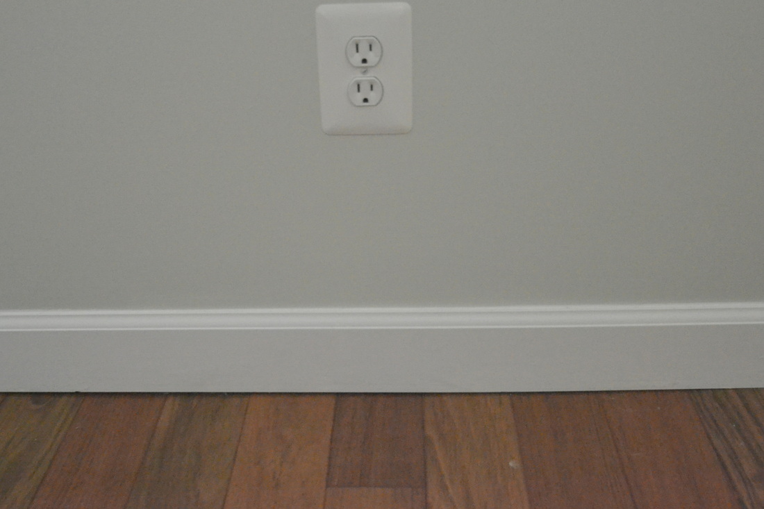
If I leave the dressers in their current location, I'd love to hang paintings like this above the outer two {from Marianne Simon Home} 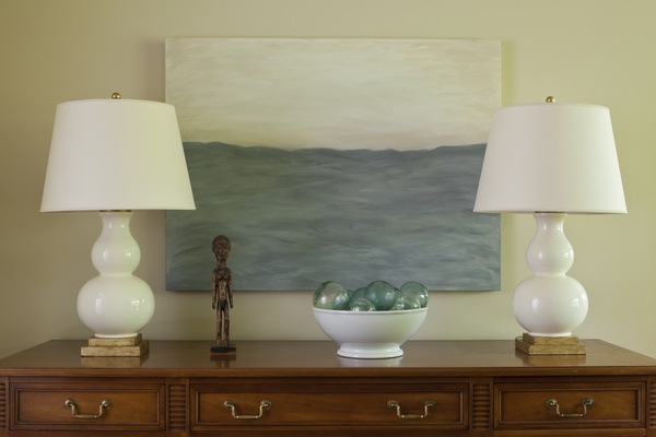
I absolutely LOVE this collection of silver-framed black and white photos {below} from Nine and Sixteen: 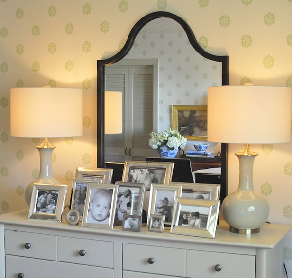
"Nautical chic" from Restoration Hardware: 
And I think these bed linens and drapes are so simple and beautiful {from Brian J. Mc Carthy via Elle Decor}: 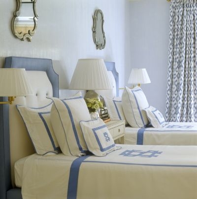
So there you have it! The beginning of a plan.
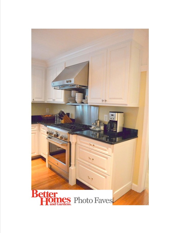
Think blue, white, silver, tailored, and simple. Have a great weekend! :-) Hey all! So I just got an email that one of the photos from my kitchen remodel is in the running for Better Homes and Gardens Photo of the Week! I'd really appreciate it if you would vote here. For more photos, check out the original post. Thanks so much in advance! :-)  Hey there! First, I'd like to give a BIG shout out to Remodelaholic and DIY Showoff for featuring my powder room Before & After. Thank you so much! It's amazing how a little blog love can make a girl's day! :-) And now...on to the next project...the master bedroom! Let me just say this: the previous owners of our house were nothing if not consistent. They went ALL IN on the dark red and navy color scheme, including all the woodwork. Here's what the master bedroom looked like before. The Lowdown Floors: White wall-to-wall carpet Walls: "Builder white" with red and navy stencils Built-ins: Red-painted cabinets White ceiling fan 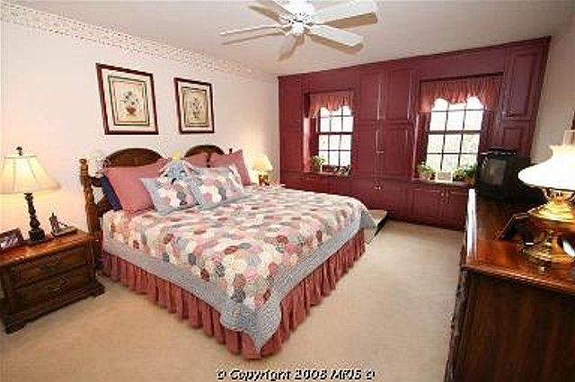 Here's a close-up of the built-ins. Notice that the actual window frames are also painted red {an issue we have still not resolved throughout most of the house}.  Here's where Brian and I disagreed: I thought the built-ins would be nice if we could paint them, because they added a custom touch to the room. Brian wanted to take them out because 1) they ate up square footage in our little house, 2) painting them was going to be a TOTAL pain, and 3) they weren't deep enough to hang anything, so we could only use them for stacking sweaters and stuff. So we lived with it like this while Brian tried to convince me that they sucked. Note that we installed plantation shutters, painted over the stencils {that was like priority number ONE before we even moved in, no matter how bad it looked!} and put down taupe Berber carpet as an interim solution to the white wall-to-wall.  But eventually, he wore me down and ripped out the built-ins. I still think they could have worked, but {I'm told that} compromise is key in these situations! {Normally I'm super stubborn, so I'm glad I have photo evidence of The Time I Gave In! Haha!} Look at that satisfied smile. Ugh! 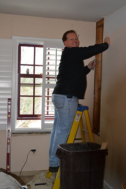 Below you can see the loveliness that is our master closet/bath area. Brian framed out the door so while we're contemplating what to DO with it, at least we don't have to LOOK at it. ;-)  This is how we live: one night, I was giving the boys a bath and walked back here to get some shampoo. No can do! My husband had temporarily drywalled himself in.  ...but eventually he got out. He's handy like that! :-)  Once the door was framed and the drywall was patched, we were able to install the new hardwood floors! These are the same Brazillian Cherry hardwoods that we used elsewhere in the house. I love them because of the color variance among the boards {and I think this is where a good installer is critical, because they laid it out very well}.  Below is the view towards the master bathroom, if you're standing by the windows. You can see the little hallway with closets that leads to the master bath, and the door framed/drywall patched. You can see that we had to sacrifice the base moldings too.  Here's how it looks now. The walls are painted in a bluish/greenish gray, which is a little greener than I thought but it's a nice "watery" shade. Like a spa! That's what I tell myself. A spa with a red buffalo-check wallpapered bathroom! ;-) Crown and base molding were installed, we added downlights on a dimmer, and the fan was replaced. You can see we have a lot of work left to do: area rug, bedding, drapes {how would that look with the plantation shutters?} and probably moving some furniture around too...  Right now, we have the bed, 2 matching nightstands, and 3 {yes, 3!} dressers lined up across from the bed. We thought that they would look cohesive and built-in since they are all the same style and the middle one is lower, but they just look like 3 boring dressers lined up with a TV mounted on the wall above.  I recently read that when decorating your master bedroom, you should start with your vision of the perfect hotel room. Isn't that a good idea? I'll be back with some inspiration photos and ideas, but I'm open to suggestions too! Happy Wednesday! :-) |